Server Provisioning Timeline
Timeline to track server provisioning progress
About
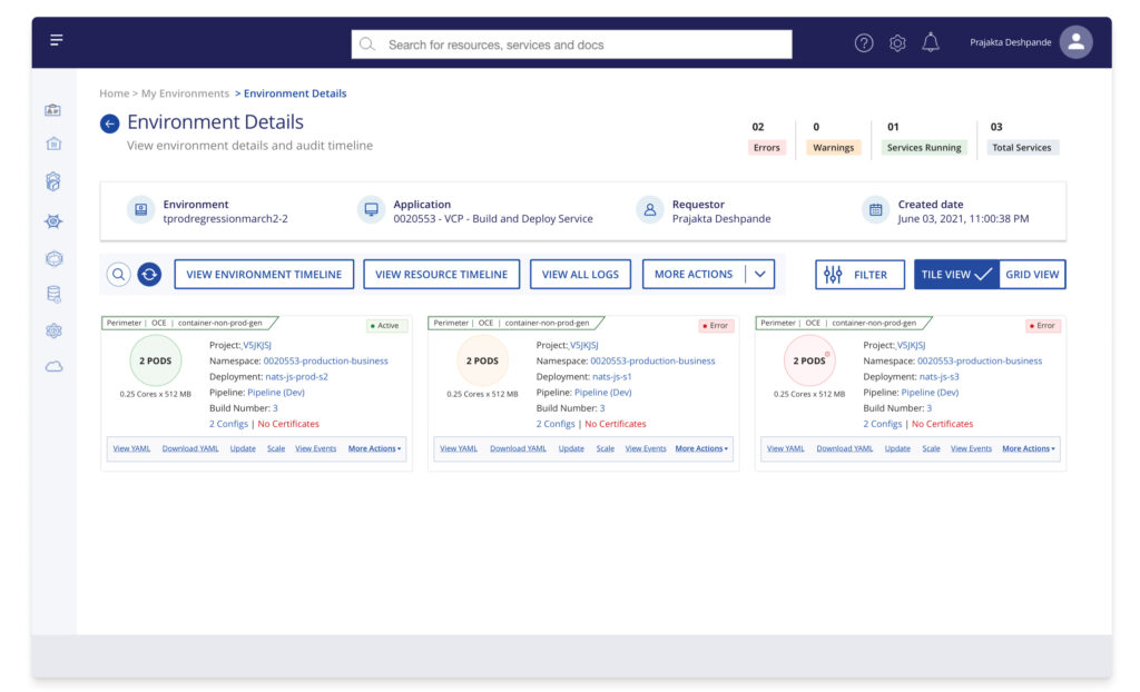
Server Provisioning Timeline is an interface for private cloud that allows users to provision servers, check status updates & urgent notifications from the system.
Overview
Improving how the timeline tracks and communicates server status to minimize delays and ensure successful deployments.
Responsibilities
Research (Qualitative & Quantitative), Wireframe, Design (low-fi & hi-fi), Prototype.
The Problem
The timeline was redesigned without research. Users faced many issues with the redesigned timeline which called for a revamp with research. Some of the more prominent ones were –
• Discrepancy in front-end & backend
• Overloaded pages slowing down the system
• Hidden information on server provisioning
• Lack of communication (emails, notifications)
• Delayed deployments
• Multiple clicks to view or perform action on any server
Solution
With our design thinking approach,
we followed a 3-step plan
Understand
Current timeline Research
Design
Wireframes, Prototype
Evolve
Usability Tests
Step 1
Learn
Learn from the current timeline experience, clear initial queries, understand user pain points.
Current timeline Research
Since this was a redesign of the current version, I analysed and conducted research on the live version of timeline.
User Interviews
Me and my team mates conducted contextual interviews to gather feedback, determine what employees think of the content, user journey, visual elements and identify usability issues that exist in the container flow and timeline.
![]() “The first pain point is to get into this page, It takes a lot of time. Also, many a times the no. of pods comes as zero which is confusing. But I mean it should not even come up. I mean if it is slow we understand this is slow but not wrong information.”
“The first pain point is to get into this page, It takes a lot of time. Also, many a times the no. of pods comes as zero which is confusing. But I mean it should not even come up. I mean if it is slow we understand this is slow but not wrong information.”
– Quote from an Employee
Synthesis
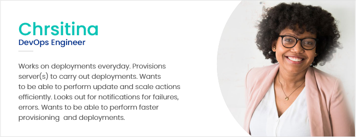
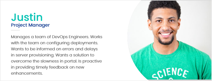
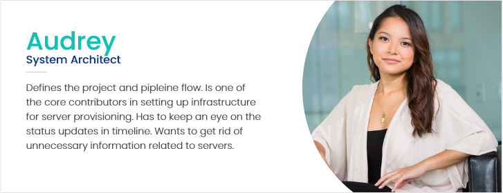
Based on the initial research and persona mapping, I created a list of findings and priortized them based on the majority vote from users to that finding. This was done with the help of affinity maps. On presenting the same to product team, they could identify underlying short and long term solutions with this synthesis as base.
Goals
Based on the research synthesis, these were the main goals of the project.
Easier Communication
Users wanted to be informed on any updates, errors, failures and warnings related to deployments. The content and visuals were misleading and users expected a solution to this.
Easier Access to Information
The live version of environment timeline was nested and users had to click multiple times to view or perform any action on servers. One important feedback from users was to minimise the number of clicks and get easy access to information.
Technical Quick Fixes
Users needed quick fixes for issues like slow system, discrepancy in data, delayed actions. There was a scope to fix these issues independent of the UI and UX.
Step 2
Design
Visualize the flow in a way that addresses user pain points and can be scaled keeping up with the user experience.
Prototype & Features
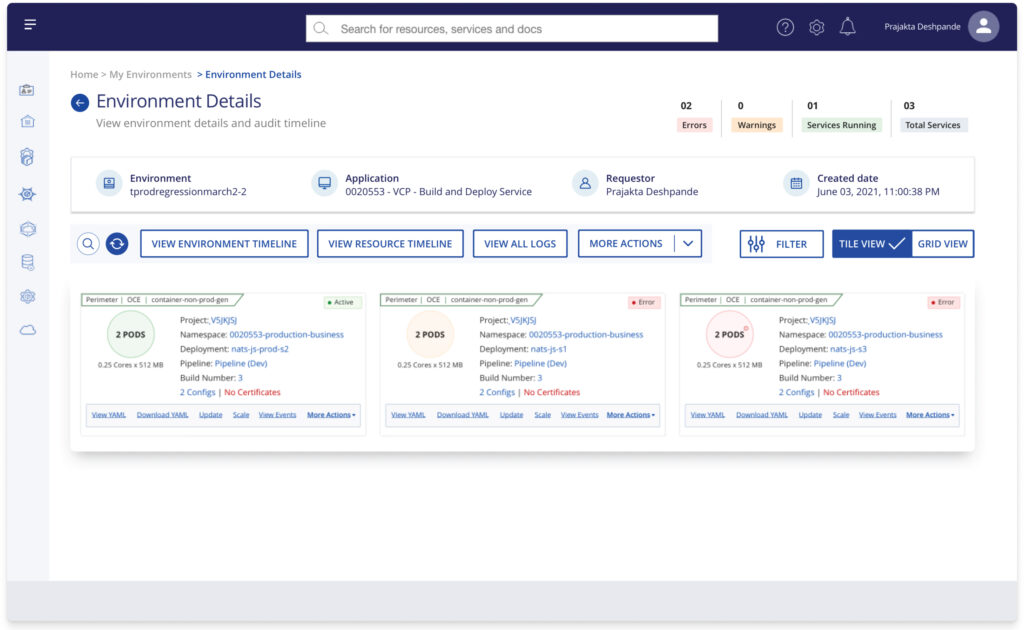
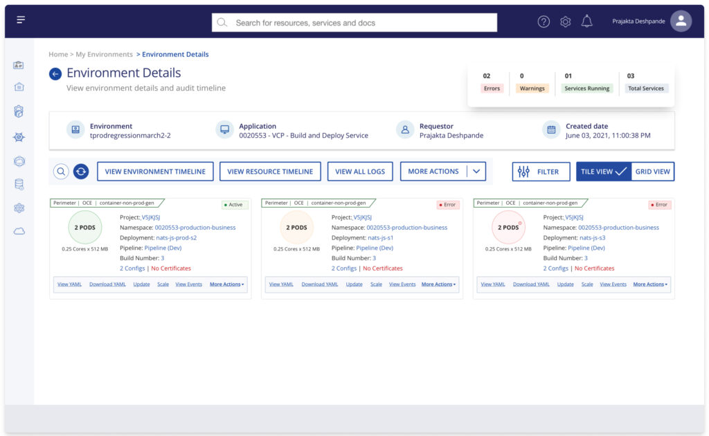
Enhanced Information Tiles
The contextual enquiries helped me understand the engagement issues & focus on increasing visibility. I redesigned the tiles in a way that they can showcase all the information related to a project & deployment.
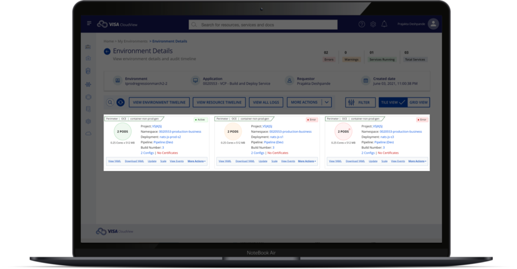
10%
Increase in successful deployments in a month.
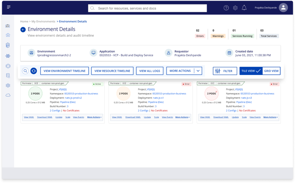
Easy Access – Control Panel
Introducing a control panel allowed all important features to be a click away & helped maintaining context to the current information which was a win-win.
Notifications
Adding notifications helped users get a quick update of what’s happening with their servers. This aimed at reducing the support tickets & dependency.
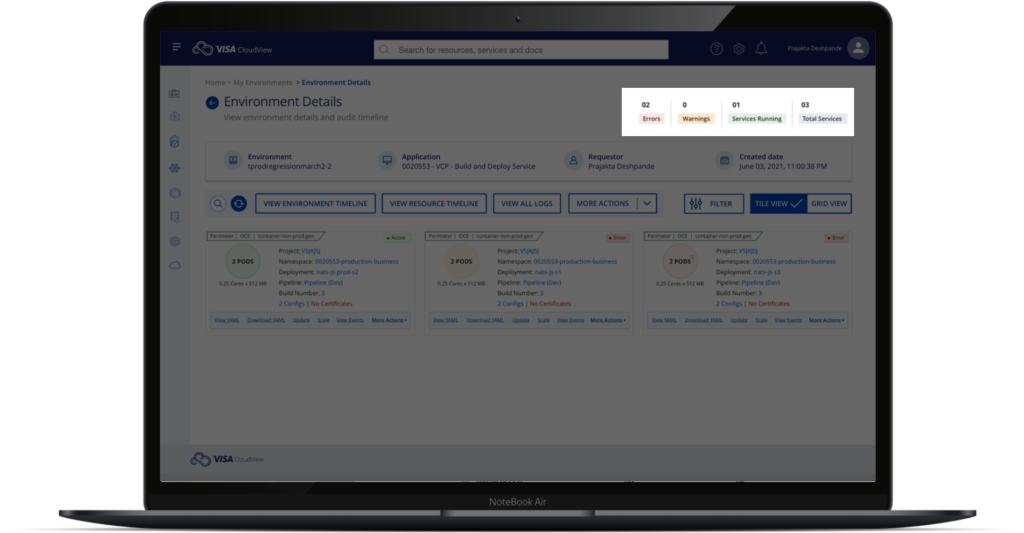
23%
Decrease in support tickets in a quarter.
Step 3
Validate
Design continues to evolve but it is worth the efforts only when validated with target users. I used usability test as a validation method.
Usability Tests
After creating a new version of designs, I ran them through a couple of users to get feedback and understand their views. The response to redesigned UI was overwhelmingly positive. We conducted follow-up feedback sessions with selected users. Most of them expressed that the new timeline addresses their concerns and is easy to use than the existing one which was highly needed.
![]() “This is what I was looking for. The control panel is great and solves most of my issues. I like the way information is displayed on these tiles. A much needed change. I look forward to benefit from this.”
“This is what I was looking for. The control panel is great and solves most of my issues. I like the way information is displayed on these tiles. A much needed change. I look forward to benefit from this.”
– Quote from an Employee after Usability test

